For the project Souvenirs we had to create ten final postcard sized images relating to the theme. For this we could have our postcards as the actual souvenirs I decided to have souvenirs in my postcards. I created 10 images relating to different destinations around the work these included places like New York City, Japan and Russia amongst others. I feel that some of the postcards may have been a little bit confusing to some people but truly it was quite understandable.
I had originally decided to make a postcard for each destination so get 10 different location shoots, I struggled to this as I couldn't get ahold of the stuff so in then I decided to create two for both Russia and Japan but the remaining six were completely different locations which really helped the diversity of the locations in the postcards.
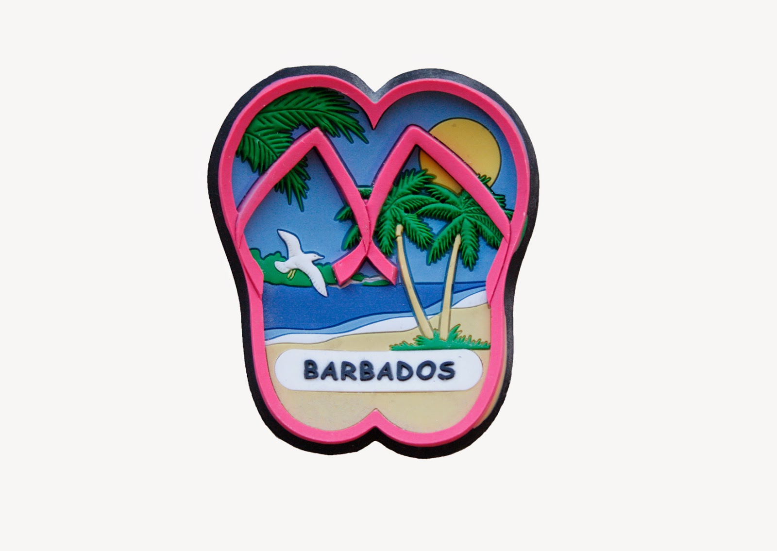
I think that a lot of the postcards came out really well mainly the simplistic Japanese card, the bottle cap one and the Barbados one are the ones I am most proud of as I feel that despite being very simplistic they do remind me of actual postcards which is exactly what I wanted to go for.
For some people the New York one may have been a little bit confusing but really if it was on sale in New York most people if not all would understand it. The only real thing is that no-one really knows anything about New York so that was a flaw on that part but in the city itself there would be little to no confusion over it whatsoever so I still think it is a good postcard regardless of what others have said about it.
The actual shoots went really well I did main shoots of Japanese and Russian items I got a large range of items for this shoot a lot of these images really helped me when it came to creating the final postcards which means that this photo shoot was vital. It was the main shoot of the assignment and I feel I would have really struggled had I not done this shoot but thankfully I did and it came out really well.
All of the other shoots I did were just compiled one as an evaluation of them as I took one or two images every so often, these were also a main part of the project and a fair few postcards were created by using these images.
Overall I would say that my final images came out really well and that I had no major problems during the project and I would say I enjoyed it and if I did it again I would focus on creating the final images earlier on and not leaving them to the last few days and spend the last couple of days doing the written work instead of the other way round. Anyway I am happy with my final images.
Thursday, 2 April 2015


Wednesday, 1 April 2015
Photoshoots (other items)
My other photo shoots were decent shoots as I managed to a fair few decent images that I could use to create a few postcards from.
 This image was of a Vietnamese cake box, with my photo of a Korean bottle top and some of the Japanese items I could create a postcard of East Asian items. This item gave me the idea of collecting more food related items but instead of East Asian food, Eastern European, except Russia, due to the fact I already have a large selection of Russian items and I don't need anymore.
 This was one of the harder items to take a photo of because my reflection kept getting in shot so I had move away from the reflection in the keyring so that I could get the right image. After I did this I managed to get the image I was looking for without any reflection on the keyring at all. I think that it created a pretty good image in the end one that I could probably work with and be able to create a final image using this image which would be a really good thing to do.
 This image is a New York fridge magnet which has been used in a postcard advertising the city. This item wasn't the most difficult to shoot, it did have a small reflection on it but I managed to avoid it when taking the photo of it. Overall looking at these photos and all of the others I took after a little bit of tweaking and changing where I take the photos the actual shoot came out really well and I have used all three of these images for either a final postcard or one of my monoprints so I am really happy with the shoot.
Michael MacGregor
Michael MacGregor is a Scottish photographer who is best know of his photos of the North-West of the Highlands of Scotland which is also has sold as postcards.
 This image is of the highlands in Scotland, it reminds me of an area where I was staying recently in Scotland, I looked over some images from that time, it isn't the same place, but is very similar. The hill also reminds me of the mountain in Ansel Adams' 1942 picture The Tetons and the Snake River that I mentioned in a previous artist research. This mountain is more like the one in Adams' photo.
 This image also reminds me of somewhere that I have been on holiday whilst in Scotland. It like the others that MacGregor has taken is really spectacular it shows of all the beauty of the highlands of Scotland. It also reminds me of a couple of images that I have taken whilst in this region. I feel that this just simply emphasises my opinions of MacGregor being a great photographer. If I saw this image as a postcard in the shops in Scotland it would be one I would buy and send to someone at home it is a brilliant photograph and as a postcard.
 This is another photograph taken by MacGregor that shows off how spectacular the region is and it also shows off Michael's incredible photography skills. This is another image of his that if I saw in a shop as a postcard I would buy without a shadow of a doubt and send home. Just looking over not just these three photographs but all his others prove that he is a brilliant photographer and he knows exactly what sort of image is needed to create a fantastic postcard displaying the pure beauty of the Scottish Highlands.
Mono print
For the next mini task we had to create a mono print of a picture that we had taken during this project. I started off with a couple of simple pictures so I could get to grips with it, after early struggles I managed to get it working fine and I would go on to attempt a difficult couple of images which actually came out a lot better than I thought they would.
After finally completing a print I continued to create more as I enjoyed it so much by the end of the day I ended up doing about five different prints most of which I felt came out really well and a fair few of them I am really proud of. The one that looked the best unfortunately had a mark from a previous one over it, it is quite faint but does really ruin the image, which would have been quite good had the mark not been on there.

After finally completing a print I continued to create more as I enjoyed it so much by the end of the day I ended up doing about five different prints most of which I felt came out really well and a fair few of them I am really proud of. The one that looked the best unfortunately had a mark from a previous one over it, it is quite faint but does really ruin the image, which would have been quite good had the mark not been on there.
Friday, 27 March 2015


Photoshoots (Japanese & Russian items)
This shoots I did of the collection of Japanese and Russian items was a really successful shoots, for this shoot I had a large and vast range of Japanese and Russian items.
For this shoot I went up to a room and spread out all the items, the way I wanted them to be laid out and then took photos of them, these were moved around so I could try and get the best possible images to create the postcards. This was a very successful shoot I got around 50 or 60 images to work with, this really helped I know that these postcards will be the best as I have so many more from this shoot.
 The selection of Russian items was more military based and it allowed me to take photos of items that I had not only never taken a photo of before, I had never seen with the naked eye before, so it would be interesting to see what sort of images I could get as well. I was also provided with a Russian flag as well for the shoot, this really helped emphasise that these items are Russian because there would be a few people that wouldn't know where these items would be from.
 The selection of Japanese items were more varied which allowed me to get more different images to the Russian images, there were a lot more items to work with. The items including bottle caps as demonstrated by the image at the side, there was also CDs, books and clothing. The hardest to work with without a doubt was the CDs this was mainly because the sunlight through the windows reflecting on the CD case so I took several images, moving it around until I managed to get an image that didn't have any sort of reflection on it. Also even without the sunlight on the case, my reflection of taking the image appeared in the images which wasn't helpful, but I managed to move the CD and myself when taking the photos so I was positioned in a place where not only would I still be able to get the image straight on and not get any reflection in the image.
Overall I would say that this shoot was a success and that I will be able to create a couple of really interesting postcards from the images that I managed to collect from this shoot.
For this shoot I went up to a room and spread out all the items, the way I wanted them to be laid out and then took photos of them, these were moved around so I could try and get the best possible images to create the postcards. This was a very successful shoot I got around 50 or 60 images to work with, this really helped I know that these postcards will be the best as I have so many more from this shoot.
Overall I would say that this shoot was a success and that I will be able to create a couple of really interesting postcards from the images that I managed to collect from this shoot.
James Bell
James Bell is a British photographer who is best known for his Lake District which he has been known to sell as postcards.
 This photo is of a valley in the Lake District, this is a photo that I really like because it shows off a lot of the beauty of the valley, it also shows that you don't need a clear day to take a good landscape photograph. Also with the sunlight coming through the gaps in the valley on to the bottom of the valley really give it a true beauty. This is a sort of photograph I would buy as a postcard, it is easily one you could see in a shop and people buying. I think it is a very strong landscape image and one of the best I have seen.
 This image is of a lake in the Lake District, this image is different to most others that people are likely to take of this lake, as most people are likely to try and get to higher ground to take a photo of all the lake whereas this hasn't been done. This is the reason why I think this is a really strong image, this is the sort of of image you are likely to see as a postcard in the shops of the Lake District. The reason that I like this image is he has taken the image from the same level of the lake and not tried to get to higher ground. If he had taken this photo from higher ground, it wouldn't be the image it is, it may still be a decent image but it certainly wouldn't be anywhere near as good as this image is. I also like how there is so much to the picture, your eyes are normally drawn straight to the lake but there is also quite a lot else to look at, which make the photo interesting. This is an image that when sold as a postcard I am likely to buy straight away it is also another reason why I think James Bell is a fantastic landscape photographer.
 This image I feel is the best of the three without a doubt. This image is of another lake in the same area as the other three, the main reason I like this image is because it doesn't just show of the lake it also shows off all of the area, the mountains in the background. This image would probably work really well in colour as well but it is a very strong image in black and white as well and even though I haven't seen the image in colour I do prefer the image in black and white as it really shows of the location really well. To be fair good landscape image do actually look better in black and white depending of whether the actual location is quite colourful. This image reminds of some of the images that Ansel Adams would produce, the mountains in the background remind me of one of his image The Tetons and the Snake River from 1942, I know the images don't look that similar but there is something about the two images, and this image reminds me of that image.
Thursday, 26 March 2015
Warner Gothard
Warner Gothard was a British photographer who was based in Barnsley. Gothard was known for turning his photographs into postcards these would incorporate family portraits as well these were normally to advertise different locations around Britain.
.jpg) This postcard shows off different locations of Barnsley, it shows what it is like in the city. The postcard mixes in different locations, a bit of text and images of a group of children. To me the image of the children looks like it has been put together, meaning that I believe the images of the children were taken separately and then added together on the postcard. This postcard I don't really like as it doesn't really seem very interesting at all. This seemingly is trying to show off Barnsley and I know the photos were taken over 100 years ago, but this would still make me think about going elsewhere instead of Barnsley. It might advertise he city as best he can but to me it doesn't really attract me to the city.
This postcard shows off different locations of Barnsley, it shows what it is like in the city. The postcard mixes in different locations, a bit of text and images of a group of children. To me the image of the children looks like it has been put together, meaning that I believe the images of the children were taken separately and then added together on the postcard. This postcard I don't really like as it doesn't really seem very interesting at all. This seemingly is trying to show off Barnsley and I know the photos were taken over 100 years ago, but this would still make me think about going elsewhere instead of Barnsley. It might advertise he city as best he can but to me it doesn't really attract me to the city.
.jpg) This postcard shows of Barrow Colliery in Barnsley. This like his previous image incorporates portraits of people as well. This image I feel is a better postcard than the one above, but like the one above it doesn't attract me to Barnsley and also it doesn't make me want to send it to family members whilst on holiday. What puzzles me the most about this postcard is the actual location chosen, it really isn't the first place you would go to, to create a postcard. But it could be a vital part of the history of Barnsley, which if it is makes it an interesting postcard, but to me I wouldn't know so it doesn't interest me at all.
This postcard shows of Barrow Colliery in Barnsley. This like his previous image incorporates portraits of people as well. This image I feel is a better postcard than the one above, but like the one above it doesn't attract me to Barnsley and also it doesn't make me want to send it to family members whilst on holiday. What puzzles me the most about this postcard is the actual location chosen, it really isn't the first place you would go to, to create a postcard. But it could be a vital part of the history of Barnsley, which if it is makes it an interesting postcard, but to me I wouldn't know so it doesn't interest me at all.
.jpg) This postcard shows the Cudworth Railway accident in 1905. I don't understand why someone would want to make or even buy a postcard of this. I can fully understand why somebody would photograph this incident to document what has happened. But then to create it as a postcard truly puzzles me. To be fair looking at this, even though it was 110 years ago could well make people anxious about using this railway. Personally I don't really like this image as it doesn't interest me at all as separate images or as a postcard.
This postcard shows the Cudworth Railway accident in 1905. I don't understand why someone would want to make or even buy a postcard of this. I can fully understand why somebody would photograph this incident to document what has happened. But then to create it as a postcard truly puzzles me. To be fair looking at this, even though it was 110 years ago could well make people anxious about using this railway. Personally I don't really like this image as it doesn't interest me at all as separate images or as a postcard.
Friday, 20 March 2015
Ross Halfin
Ross Halfin is a British photographer who is best known for his rock and roll photographers that he has sold as postcards. These images have been really popular and have sold really well.
 This image is of Joe Perry, lead guitarist of rock band Aerosmith the image shows Perry stood outside a building which on close inspection looks like some sort of church or religious building. This image is pretty good as a portrait but personally I'd probably not sell it as a postcard because it, in my opinion doesn't look very good as a postcard it would probably look better as an A4 or A3 poster which would be framed. I do like the actual image but not how it has been sold, I like his pose that he has in the image I think it is the sort of pose that a rock star would do and is very suited to his demeanour.
 This image shows Iron Maiden, a British heavy metal band. The image shows the five members of the band stood next to a white wall with their shirts off. This image is good simply because it shows of what their are like, as a metal band running around stage or their music videos with their shirts off is kind of something you would expect them to do. But really it is just them standing against a blank white wall and I can understand why people would probably buy it but personally I wouldn't it doesn't interest me at all. Most people who would probably buy this would be Iron Maiden fans, some may buy it if they are a fan of Halfin's work
 This is a collection of different postcards he has created people who feature in this collection including Ozzy and Sharon Osbourne, Keith Richards and Marilyn Manson. This image clearly shows that his images have many different styles to them. It also shows that he does take some of his images in colour but that he very rarely does this. By the looks of it he also does from time move away from rock and metal but this like colour printing is also a rare occurrence. I personal wouldn't buy any of these but fans of the artists and of Halfin probably would.
Friday, 13 March 2015


Walker Evans
Walker Evans was an American photographer who was known for taking photos of the USA during the Great Depression during the late 1920s and 1930s, he would also turn them into postcards. He would also take some fairly iconic images of the depression era America.
 This photo was taken at National Biscuit's New York cracker factory. This postcard was taken in June 1948. It shows how the factory looks during working hours it shows that it isn't that busy as they are probably still building up the business after World War II. This probably wouldn't attract me to New York, even though now it is vastly different. It really shows the industrial side of New York and not the tourist side of it, which is what most of the postcards actually are of.
 This image was taken at a bath house at Hot Springs National Park in Arkansas. It shows several men using the facilities there. To me it is a decent postcard as it shows off some of the facilities but it doesn't really show off part of the park that people are most likely to want to see.
This image was taken sometime during the 1920s. It probably wouldn't attract me to the place now, but I believe that nearly 100 years later it is likely to have changed drastically over time.
 This photo was taken in South Coventry, Connecticut. This image was probably taken shortly after World War I. It does look like a Victorian Era photo but Evans was born in 1903 after this era. It was taken at the RR Station and it shows of that it is a small place to stop and it would probably have attracted people to it when it was taken but I believe that it wouldn't now because if it is still there it has probably changed a lot since this photograph was taken and people who saw this image would probably want to see it how it is in the image.
This image was taken sometime during the 1920s. It probably wouldn't attract me to the place now, but I believe that nearly 100 years later it is likely to have changed drastically over time.
John Hinde
John Hinde was a British photographer who would then turn some of his photos into postcards, the postcards that he created also had a painted feeling to them which he probably added when creating the cards. He founded John Hinde Ltd. in Dublin in 1956 after a failed venture into circus life, this is where he began taking his photos of Ireland, these would over time become some of his best known work. During the 1960s and 70s he began creating postcards for Butlins Holiday Camps. When creating these he was more of an art director than an actual photographer he would take some of the photos himself but he did hire three fellow photographers to take the images.
Looking over a wide range of his postcards and photographs it is no surprise to find out that millions of his postcards sell. He has created some truly beautiful postcards that show of British holiday locations at their best.
 This image was taken in St. Mawes, Cornwall. This shows two young children sitting near some what I believe are fishing boats. This postcard is created to show of the location as a holiday location, I believe that this works really well it shows off the location really well, it also shows a bright sunny, cloudless day which would attract people as well but he wouldn't take a photo whilst it was raining. It also shows two young children who look like they are enjoying the area as well so I know a fair few people who be attracted to this place by just simply looking at this postcard.
 This photo was taken at the Giant's Causeway in Country Antrim, Northern Ireland. This image show a couple of people walking over it. This image show of the beauty of this iconic British landmark. There are many people who would want to go to the location even before seeing this postcard, but it shows of the location at its sparkling best and in the sun it would easily attract more people to the location. Just simply looking at this postcard it could easily attract many more people to it. One thing this postcard doesn't show is how popular the Giant's Causeway is, but that is a good thing as it allows you to see more of this iconic location.
 This photo was taken on the High Street in Stratford upon Avon. This image shows many different people enjoying the sights they are a diverse age range of people. This is already a location that would attract many tourists as it is the place William Shakespeare was born. This postcard just makes the area look more spectacular and shows people what it looks like for those who don't know. The flowers in bloom, the vast age range and sunny day is bound to attract many people. Even if people knew nothing about the town, it is likely to attract people to it as looking at this postcard it is very British and that is likely to attract many tourists from the US. But it is a brilliant postcard that it likely to help the area attract even more tourists to the town.
Looking over a wide range of his postcards and photographs it is no surprise to find out that millions of his postcards sell. He has created some truly beautiful postcards that show of British holiday locations at their best.
Thursday, 12 March 2015
Mini task 2
For this second mini task we had to create a postcard by taking some of the images we had already taken for this project and cut them up and and paste them onto another image. For this I took an old image that I had taken and got several images that I had taken for the project, I then cut them out and stuck them over the heads of the players. For this I just got a random collection of images and souvenirs that I had taken over the project and simply just try to resize the images so that they would fit over the players some of the images are over two of the players faces. I did struggle to think up any ideas for this mini task this was before I looked over my football images and found this image. Then it was a task to find specific images that I could stick over the players faces. It was quite frustrated as some of the souvenirs I picked were too big but I feel I found enough to work with.
Overall it came out quite well but I do think it could have been better had I had longer to do this and I would have spent a while thinking what to do for it, but anyway I like my image.

Overall it came out quite well but I do think it could have been better had I had longer to do this and I would have spent a while thinking what to do for it, but anyway I like my image.
Proposal
For this project I will be photographing different souvenirs that people have picked up when they have been abroad on holiday, the plan is to take photos from any country other than the UK or Ireland. I am also aiming to get as many countries as possible into this shoot so I have a wide range when choosing the images for my postcards. I want to this for the project as it will be something completely different to anything I have done before.
I am likely to use a wide range of cameras, so far I have taken a couple photos on a Canon 1000D, the plan is to use a 40D, 5D Mk III, and a couple of other cameras I have at home, these aren't DSLR cameras, these are compact cameras these are to given a wide variety of shots and shot types through using these cameras. All of the images will be in colour as I feel that the images probably wouldn't look very good in black and white so I feel it is for the best.
The images will be shown as postcards, the main purpose is to inform people about the different places that will make up the postcards that I will be creating. I hope that will also provide information about these places as well.
I have everything I need for the shoots ready so it should be no real problem and the places I want to go to do require permission but I already have that sorted so that is a big help, it allows me to get my photos done a lot quicker than they would have been done, simply because I have my locations picked and ready to use.
With the shoots the skills that I will need are quite simple, I will need to know how to position the lights properly so that the objects I am photographing don't look overexposed or underexposed. I will also need to know how to photograph the objects properly and I have experience in photographing these sorts of items before so this should be no problem whatsoever.
When it comes to getting access to the equipment I will require this has already been sorted out, which is a big help and also means that I can get it all ready for when I do the first shoot.
I don't think that will be to much risk when taking the photos, I feel that the only risk will probably come from the lights in the studio but I know how to work with these without getting injured and it is simple all I have to do is avoid touching the actual bulb whilst they are on and for a while after they have been switched off.
I have created a week by week plan so I know when everything needs to be done by so by sticking to this I should get everything completed in time.
Friday, 6 March 2015
Sewing and Painting images
For a mini task we had to sew into some images and paint on to them as well. We started off by sewing into a picture of Elvis, before going on to another picture of him and painting on to it. The sewing went quite well as someone told me it reminded them of guitar strings which Elvis played, the painting was just a little bit random as I simply just painted all over in different colours. The sewing one I thought was better mainly because I had no real problems with it whereas when we did this last year I did. The painting image wasn't that bad but I do have different ideas what I could of done instead, which include different colours and different patterns on the image which would cover the entire page. I then began sewing into one of my own images this mages was a Russian badge so I decided for this I would sew a Russian flag into the image above the badge, doing this was actually quite easy and it did turn out quite well.
Overall I would say that it went well but at times I did get a little frustrated with it but the images came out really well despite this happening.


Overall I would say that it went well but at times I did get a little frustrated with it but the images came out really well despite this happening.
Friday, 27 February 2015
Initial ideas
Souvenirs
Holidays - Foreign holidays not UK or Ireland
Mixture of Eastern and Western
Wide range of choices.
Holidays - Foreign holidays not UK or Ireland
Mixture of Eastern and Western
Wide range of choices.
Introduction
This project is all
about creating postcards; the main theme of this project is souvenirs. The main
aim of this assignment is to produce 10 postcard sized images on the theme of
souvenirs the images have to be 148mm x 105mm. The souvenirs could be our own
or other peoples that they have collected over time, they may also be real or
fictitious. We will have like most other projects, six weeks to complete it. For this project other than souvenirs it is completely our choice what we base it around and this should prove to be quite enjoyable to do.
Health and Safety (Display Screen Equipment)
The DSE is about regulations when using a computer and other similar devices it advises you about how it the correct way to use these as in when you are sitting a computer to avoid back strain and eye strain and also with laptops as well to also help to avoid eye strain on these. It also gives advice on how the keyboard should be positioned, how the work surface should be, the space requirement, lighting. Other things it mentions are reflections and glare, noise, humidity and computer/user interface. These would also be very important to photographers as they will have use a computer a lot due to editing photos and sending them of to the right people who need the photos. This is of the three, the computer, work health and safety and COSHH is probably one of the more important because as photographers we will be using screens like this a lot of the time even when we aren't editing photos.

Control of Substances Hazardous to Health (COSHH)
The Control of Substances Hazardous to Health (COSHH) is statutory instrument of the United Kingdom that states general requirements on employers on how to protect employees and other people from hazards of substances used at work by risk assessment. This could be considered quite vital in photography due to the chemicals used in the dark room, so we will need to know about this if we are employed in a place that uses these chemicals or if we employ someone and we use chemicals in the place of work.
Even if it is just at home where we use dark room chemicals or at college this information will be vital when using a dark room or even just simply in there so we know what precautions need to be taken when in there.
Even if it is just at home where we use dark room chemicals or at college this information will be vital when using a dark room or even just simply in there so we know what precautions need to be taken when in there.
Health and Safety at Work Act
The Health and Safety at Work Act of 1974 is an act that defines the duties for employees, employers, contractors, suppliers of goods and substances for use at work. It is the primary piece of legislation that covers occupational health and safety in the Great Britain. Companies will employ a health and safety executive and their job is to enforce the act. The act is also to try and make work a safe environment and to protect others from risks, it also tries to prevent the unlawful acquisition, possession and use of dangerous substances. These will be vital as we are likely to be working with items that would require us to follow these regulations such as lighting in studios which of course can be very dangerous.

Caravan Gallery
 The Caravan Gallery is a company that make postcards for different places, their postcards tend to take photos of the unconventional areas of the place they are

Subscribe to:
Posts (Atom)